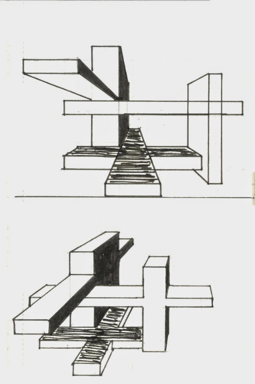
something interesting
Sunday, 29 June 2014
exp 3 final submission
exp 3 final submission
entrance and gallery
whole structure
inside of building
office of dean
Offices for Academic Staff
library
Offices for General Staff
texture
sketchup model( bridge )
sketchup model folly and moving elements
moving elements
entrance and gallery
whole structure
inside of building
office of dean
Offices for Academic Staff
library
Offices for General Staff
texture
folly
sketchup model( bridge )
sketchup model folly and moving elements
moving elements
The whole
building seems like a balanced structure, but there are many absonant parts
designed for breaking the habits. Different length of halls, organic form of
moving elements, the location of lecture theater and third floor show the imbalance.
On the one hand, I choose roundness as the main shape of this building, on the
other hand, I designed many absonant parts for avoiding being constrained by tradition
and reminding what is needed.
dropbox link
https://www.dropbox.com/sh/xgb4jc8r9as4pbe/AAB910_YBjHYTpWPd7p7o8_-a
Saturday, 28 June 2014
mash up
mash up
Less is more. Reducing
everything down to the purest, most elegant form is difficult. We
must learn what a building can be, what it should be... And just as we acquaint
ourselves with materials, just as we must understand functions. Removing all the clutter, and the contradictions,
and the character, and the color, and the messiness, and the struggle, and the
inconsistency, and the uncertainty, just to reveal an underlying structure, and
an order, and a harmony, and a calm, centered peace…, is a disservice to our
humanity. Organic architecture so
much needed if we are to
see the whole of life, and to now serve the whole of life, holding no 'traditions' essential
to the great TRADITION. Nor
cherishing any preconceived form fixing upon us either past, present or future. We continue to enlarge the divide between what we
want and what is wanted. So we must
become familiar with the psychological and spiritual factors of our day.
http://www.archdaily.com/184672/less-is-more-stupid/
http://architecture.about.com/od/20thcenturytrends/a/Mies-Van-Der-Rohe-Quotes.htm
http://architecture.about.com/od/periodsstyles/g/organic.htm
Monday, 26 May 2014
Tuesday, 20 May 2014
Tuesday, 6 May 2014
exp 2 final submission
5 lumion images
the whole structure and the landform
one side of the monuments, a strong visual impact created by the projecting structure.
stairs and aisle both play important parts in the monuments as they connect 2 monuments and each part.
night view. for reminding people of Aldo Van Eyck, I used grey bricks as floor. on the other hand, circular structure often appear in Aldo's projects, so the circular poor and fountain can be seen a strong symbol which could remind people of his circular structure.
view from back side, stair connects 2 parts and 2 texture strongly show Aldo's style.
view from another side, it shows the environment and the structure.
this part is where 2 monuments connect, I make a open space for meeting room.
sketchup model
<iframe src="https://3dwarehouse.sketchup.com/embed.html?mid=u99ab2c09-85cc-4f62-ab8a-668eccf1717a&width=400&height=300" frameborder="0" scrolling="no" marginheight="0" marginwidth="0" width="400" height="300" allowfullscreen></iframe>
3 selected texture
36 texture
3 parallel projections
lumion dropbox:
https://www.dropbox.com/sh/xgb4jc8r9as4pbe/2UULyFp7oU
Subscribe to:
Comments (Atom)


.jpg)
.jpg)
.jpg)


